See what matters and cut through the noise.

Design with a point of view.
← All projects05 / Concept Project / Digital Finance
ALTRIS
Clarity creates advantage.
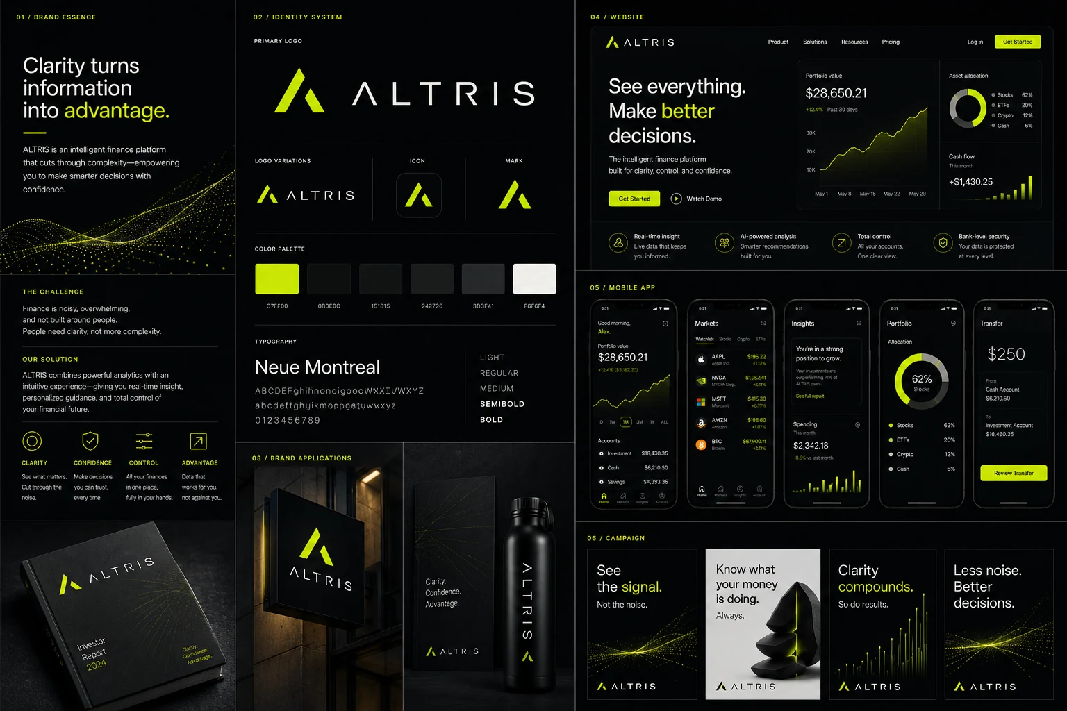
A digital finance platform designed to turn complexity into confidence through a precise visual system, intelligent product UI, and a focused high-contrast brand language.
01 / Brand Essence
Less noise.
Better decisions.
Finance is full of information but often short on clarity. ALTRIS was built around a simple idea: good design can make complex information feel understandable, useful, and actionable.
Make decisions you can trust.
Understand your full financial picture.
Turn information into forward momentum.
02 / Identity SystemSharp enough
Sharp enough
to feel technical.
Human enough to trust.
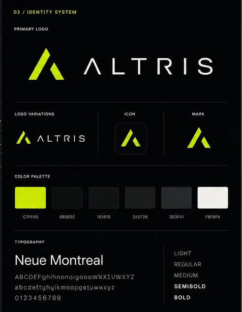
The identity pairs a geometric A mark with wide, minimal typography and one unmistakable signal color. The neon accent is used selectively so it always means something.
Information becomes useful
when it becomes clear.
03 / Product ExperienceData without
Data without
the intimidation.
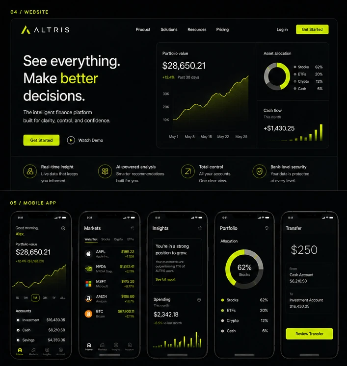
The product system gives users a clear hierarchy across portfolio performance, markets, insights, allocation, and transfers. Dense information is organized into calm, legible moments.
Live information surfaced without overwhelming the user.
Recommendations are useful, contextual, and visually secondary to user control.
Accounts, allocation, performance, and actions are visible in one system.
Security and stability are communicated through structure rather than decoration.
04 / Brand ApplicationsDigital first.
Digital first.
Not digital only.
Investor reports, environmental signage, printed materials, and branded objects extend the system beyond the interface while keeping the same disciplined visual language.

05 / CampaignSee the signal.
See the signal.
Not the noise.
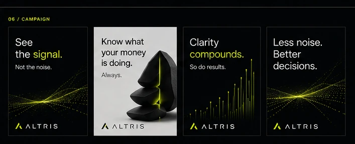
The campaign distills the platform into direct, memorable statements. Graphic waves, data forms, and the signal color connect product intelligence to a more emotional brand idea.
06 / WebsiteExplain the value.
Explain the value.
Show the product.
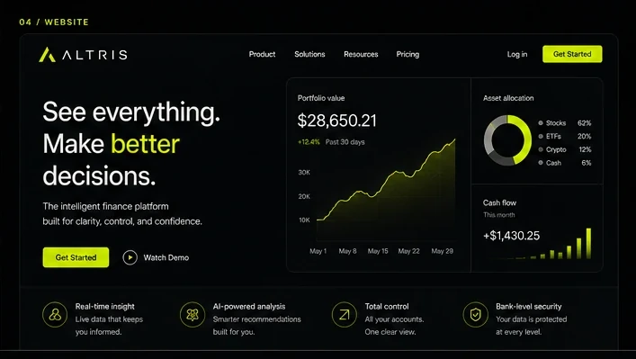
The marketing site balances clear positioning with product proof. The interface itself becomes part of the brand story rather than sitting behind generic marketing language.
07 / SystemOne signal.
One signal.
Across every layer.
The same visual principles move from identity to interface to campaign: black space, white information, chartreuse action, and disciplined hierarchy.
Concept Project / Self-InitiatedComplexity in.
Back to selected workKRAVEHAUS↗